Get the most out of CausalNex plotting
The goal of this tutorial is to help you build pretty and meaningful plots from CausalNex networks. We will help you customise your graph for your specific application, whether you seek a specific trend in the network or you wish to use the plotting in a presentation or article.
We will go through the following items:
Explore customisations available in CausalNex:
A huge number of customisations is possible, which can make the existent documentation overwhelming.
With examples, we show the main customisations available, and give tips of meaningful choices.
Understand
pyvis, the engine used in CausalNex visualisations:Explore alternative solutions:
We exemplify how to use
networkxfor plotting. This may be a friendly alternative, as it uses matplotlib to render the images.
Explore customisations available in CausalNex
In this tutorial, we work with following Bayesian Network structure, known as “Insurance network”. This network was first introduced in 1.
Note that we create random weights for each edges. These could mean, in a real model, any indication of the edge strength, such as the weights output by NOTEARS.
[1]:
import numpy as np
from causalnex.structure import StructureModel
from causalnex.plots import plot_structure
from IPython.display import Image

import warnings

warnings.filterwarnings("ignore")

from itertools import chain

edges = [
    ("Age", "SocioEcon", {"weight": 0.37}),
    ("SocioEcon", "OtherCar", {"weight": 0.95}),
    ("SocioEcon", "GoodStudent", {"weight": 0.73}),
    ("Age", "GoodStudent", {"weight": 0.6}),
    ("SocioEcon", "RiskAversion", {"weight": 0.16}),
    ("Age", "RiskAversion", {"weight": 0.16}),
    ("RiskAversion", "VehicleYear", {"weight": 0.06}),
    ("SocioEcon", "VehicleYear", {"weight": 0.87}),
    ("Accident", "ThisCarDam", {"weight": 0.6}),
    ("RuggedAuto", "ThisCarDam", {"weight": 0.71}),
    ("MakeModel", "RuggedAuto", {"weight": 0.02}),
    ("VehicleYear", "RuggedAuto", {"weight": 0.97}),
    ("Mileage", "Accident", {"weight": 0.83}),
    ("DrivQuality", "Accident", {"weight": 0.21}),
    ("Antilock", "Accident", {"weight": 0.18}),
    ("RiskAversion", "MakeModel", {"weight": 0.18}),
    ("SocioEcon", "MakeModel", {"weight": 0.3}),
    ("RiskAversion", "DrivQuality", {"weight": 0.52}),
    ("DrivingSkill", "DrivQuality", {"weight": 0.43}),
    ("MakeModel", "Antilock", {"weight": 0.29}),
    ("VehicleYear", "Antilock", {"weight": 0.61}),
    ("SeniorTrain", "DrivingSkill", {"weight": 0.14}),
    ("Age", "DrivingSkill", {"weight": 0.29}),
    ("RiskAversion", "SeniorTrain", {"weight": 0.37}),
    ("Age", "SeniorTrain", {"weight": 0.46}),
    ("Theft", "ThisCarCost", {"weight": 0.79}),
    ("CarValue", "ThisCarCost", {"weight": 0.2}),
    ("ThisCarDam", "ThisCarCost", {"weight": 0.51}),
    ("HomeBase", "Theft", {"weight": 0.59}),
    ("AntiTheft", "Theft", {"weight": 0.05}),
    ("CarValue", "Theft", {"weight": 0.61}),
    ("Mileage", "CarValue", {"weight": 0.17}),
    ("MakeModel", "CarValue", {"weight": 0.07}),
    ("VehicleYear", "CarValue", {"weight": 0.95}),
    ("RiskAversion", "HomeBase", {"weight": 0.97}),
    ("SocioEcon", "HomeBase", {"weight": 0.81}),
    ("RiskAversion", "AntiTheft", {"weight": 0.3}),
    ("SocioEcon", "AntiTheft", {"weight": 0.1}),
    ("OtherCarCost", "PropCost", {"weight": 0.68}),
    ("ThisCarCost", "PropCost", {"weight": 0.44}),
    ("Accident", "OtherCarCost", {"weight": 0.12}),
    ("RuggedAuto", "OtherCarCost", {"weight": 0.5}),
    ("Accident", "MedCost", {"weight": 0.03}),
    ("Cushioning", "MedCost", {"weight": 0.91}),
    ("Age", "MedCost", {"weight": 0.26}),
]
g = StructureModel(edges)
We will build, in this tutorial, the following plot for this Bayesian Network:
[2]:
from IPython.lib.display import IFrame
IFrame( src='supporting_files/03_final_plot.html', width="100%", height="600px")
[2]:
The customisations in the figure above include:
We order nodes vertically, according to the causality hierarchy
The edge thickness is proportional to the weight value assigned to the edge
Color target variables differently from other variables
Custom node shapes and title
The representation above makes this graph easier to work with than the out-the-box causalnex visualisation (shown below).
[3]:
viz = plot_structure(g)  # Default CausalNex visualisation
viz.show('supporting_files/03_plot.html')
[3]:
Adjusting node and edge attributes
Node and edge attributes can be changed by passing in the desired attributes as dictionaries to the plot_structure function. One can specify changes that apply to all nodes (edges) as well as node (edge) specific adjustments: - all_node_attributes: node attributes to be applied on all nodes - node_attributes: node attributes to be applied on selected nodes - all_edge_attributes: edge attributes to be applied on all nodes - edge_attributes: edge attributes to be applied on
selected edges
Nodes
Here, we make the following adjustments to our default structure.
For all nodes, we: 1. Change the shape of all nodes to a rectangular box 2. Change the background color of the boxes to a shade of black 3. Set the border colour of each box to a shade of blue 4. Change the font colour of the node labels to white
For selected nodes, we: 1. Change the background colour of these nodes as well as the colour when node is selected 2. Change their label names 3. Fix this nodes so that they cannot be moved
A full view of attributes is available at this link.
[4]:
all_node_attributes = {
    "font": {
        "color": "#FFFFFFD9",
        "face": "Helvetica",
        "size": 20,
    },
    "shape": "box",
    "size": 15,
    "borderWidth": 2,
    "color": {
        "border": "#4a90e2d9",
        "background": "#001521"
    },
    "mass": 3
}

node_attributes = {
    "Accident": {
        "color": {
            "background": "#ff0000",
            "highlight": {
                "background": "#ffcccc",
                "border": "#cce0ff"
            }
        },
        "shape": "circle",
        "size": 50,
        "label": "!!ACCIDENT!!",
        "font": {
            "color": "#000000",
        },
        "fixed": {
            "y": True
        }
    },
    "Age": {
        "color": {
            "background": "#FFD700",
            "highlight": {
                "background": "#ffcccc",
                "border": "#cce0ff"
            }
        },
        "shape": "hexagon",
        "size": 20,
        "fixed": {
            "x": True
        }
    }
}
[5]:
viz2 = plot_structure(
    g, all_node_attributes=all_node_attributes, node_attributes=node_attributes
)
viz2.show('supporting_files/03_new_node.html')
[5]:
Edges
We will make the following adjustments to our default structure.
For all nodes, we: 1. Change the edge colors as well as the color when edge is selected 2. Make edges longer
For selected nodes, we: 1. Add labels to edges 2. Add shadows to edges 3. Change layout of the edges (dashed line)
A full view of attributes is available at this link.
[6]:
all_edge_attributes = {
    "color":{
        "color": "#FFFFFFD9",
    },
    "length": 200,
}

edge_attributes = {
    ("SocioEcon", "OtherCar"): {
        "color":{
            "color": "red",
            "highlight": "#79d279", # When selected, edge will change to this color
        },
        "length": 500,
        "shadow": {
            "enabled": True, # This adds a shadow underneath the edge
            "color": "#ffff99" # Choosing the color of the shadow
        },
    },
    ("Mileage", "Accident"): {
        "label": "this is an edge label",
        "font": {
            "color": 'green',
            "size": 10
        }
    },
    ("Age", "MedCost"): {
        "color": "blue",
        "dashes": True # Turns edges into a dashed line
    },
}
[7]:
viz3 = plot_structure(
    g, all_edge_attributes=all_edge_attributes, edge_attributes=edge_attributes
)
viz3.show('supporting_files/03_new_edges.html')
[7]:
Choosing a look for your plot
In pyvis, the arrangement of the nodes and the look of the plot are determined by two parameters: physics and layout.
physics handles the arrangement of the nodes via in-built gravity models, having options like barnesHut, forceAtlas2Based, repulsion and hierarchicalRepulsion. More details about each option, together with their corresponding settings, can be found in the documentation.
The default physics engine is
barnesHutfor non-hierarchical plots andhierarchicalReplusionfor hierarchical plots.
To switch the type of physics engine, we can simply make use of the set_options method provided by pyvis. We can apply set_options on our graph returned by plot_structure. We prepare a dictionary of our desired options and provide them as input to physics under the argument options. For each of the available physics engine, we can easily customise them by modifying their associated options.
Let’s pick repulsion as our choice of physics engine for illustration.
[8]:
import json

opt = {
    "physics": {
       "solver": "repulsion",
       "repulsion": {
           "nodeDistance": 400,
           "springLength": 100,
           "springConstant": 0.5
       }
   }
} # you can switch the options here

viz4 = plot_structure(g)
viz4.set_options(options=json.dumps(opt))
viz4.show('supporting_files/03_new_physics.html')
[8]:
For Bayesian networks, it may be useful to look at the hierarchical structure of your network to better visualise the interaction between nodes. To allow a hierarchical layout for your plot, we simply prepare a dictionary of our desired layout options and provide them as input to lauyout under the argument options. Likewise, there are many associated options with the hierarchical layout. A full view is available at this
link.
In the following example, we enable the hierarchical layout and set the display of the tree to be from parent to children nodes in the left to right direction.
[9]:
import json
from causalnex.plots import EDGE_STYLE, NODE_STYLE

opt = {
    "layout": {
        "hierarchical": {
        "enabled": True,
        "direction": "LR", #LR means that the hierarchy is displayed left to right
        "sortMethod": "directed"
        }
    }
}

viz5 = plot_structure(
    g,
    all_node_attributes=NODE_STYLE.WEAK,
    all_edge_attributes=EDGE_STYLE.WEAK,
)
viz5.set_options(options=json.dumps(opt))
viz5.show('supporting_files/03_new_hierarchical.html')
[9]:
Parameters that cannot be changed through set_options
Some parameters are set within the plot_structure function as they are necessary for initialising the pyvis.network.Network object. In order to change those parameters we cannot rely on the set_options method but they must be passed in plot_structure under the argumetn plot_options. Please refer to the Pyvis documentation documentation on pyvis for a full list of parameters.
For example, to change the background color of our graph we pass in a dictionary and set the desired background color under "bgcolor".
[10]:
import json
from causalnex.plots import EDGE_STYLE, NODE_STYLE

plot_options = {
    "bgcolor": "grey"
}

viz6 = plot_structure(
    g,
    all_node_attributes=NODE_STYLE.WEAK,
    all_edge_attributes=EDGE_STYLE.WEAK,
    plot_options=plot_options
)
viz6.show('supporting_files/03_new_background_color.html')
[10]:
How to customise your layout
In order to change properties of this plot, we pass network, nodes and edges attributes. Attributes include the heading of the graph, the color or shape of node and the thickness of an edge.
Network attributes are passed as a dictionary
{attribute: value}.Node attributes are of the form
{node: {attribute: value}}, i.e., for each node, we pass a dictionary of attributesEdge attibutes are of the form
{(node_from, node_to): {attribute: value}}.The full list of attributes you can set can be found in Pyvis documentation on network. Since this is an extensive list, we only the main attributes and their meaning in the table below.
A list of useful network, node and edge attributes:
Main Network Attributes
Main Node Attributes
Main Edge Attributes
Example of changing parameters
As an example of how much of the visualisation can be customised, we use almost almost all the attributes from the table above to modify the visualisation. The result is purposely not pleasing, but shows how to obtain a very high level of control over the plot.
[11]:
# Changing attributes of specific nodes
node_attributes = {
    "Age": {  # We change the attributes of the node "Age"
        "shape": "square",
        "borderWidth": 1,
        "color": "#4a90e2d9",
    },
    "Mileage": {
        "shape": "hexagon",
        "color": "green",
    },
    "Cushioning": {
        "shape": "star",
        "label": "This is a star",  # Label overwrites the default name
    },
    "SeniorTrain": {
        "shape": "diamond",
        "borderWidth": 10,
    },
    "Theft": {
        "shape": "image", # provide the link to the image and pass it under 'image'
        "image": "https://raw.githubusercontent.com/quantumblacklabs/causalnex/develop/docs/source/03_tutorial/supporting_files/cat.jpeg",
        "size": 40
    }
}

# Changing attributes of specific edges
edge_attributes = {
    ("SocioEcon", "OtherCar"): {"color": "red"},  # setting the label color
    ("Mileage", "Accident"): {"label": "this is an edge label",
                             "font": "20px arial chocolate"},
    ("SocioEcon", "GoodStudent"): {"color": "blue"},
    ("SocioEcon", "VehicleYear"): {"width": 30},  # Thickness of edge
}

plot_options = {"bgcolor": "orange"}

viz7 = plot_structure(
    g,
    all_node_attributes=NODE_STYLE.WEAK,
    all_edge_attributes=EDGE_STYLE.WEAK,
    node_attributes=node_attributes,
    edge_attributes=edge_attributes,
    plot_options=plot_options
)

viz7.show('supporting_files/03_ugly.html')
[11]:
Optimising the network design
The next step is to use all this customisation power to actually make the visualisation more appealing and meaningful. The result could easily be used in applications such as presentations or papers, with only minor post processing, if any.
Among the customisations made in the plot below, we emphasise the following:
Color target variables differently from other nodes
Use edge weights (or any meaningful quantitative value related to an edge) to set the thickness of an edge.
Choose wisely the layout (in this case dot) that suits your application, and the parameters to allocate the nodes
[12]:
all_node_attributes = {
    "font": {
        "color": "#FFFFFFD9",
        "face": "Helvetica",
        "size": 20,
    },
    "shape": "hexagon",
    "borderWidth": 3,
    "color": {
        "border": "#4a90e2d9",
        "background": "grey",
        "highlight": {
            "border": "#0059b3",
            "background": "#80bfff"
        }
    },
    "mass": 3
}

# Target nodes (ones with "Cost" in the name) are colored differently
cost_nodes = [node for node in g.nodes if 'Cost' in node]
cost_nodes

node_attributes = {
    node: {
        "color": {
            "background": "#DF5F00"
        },
    } for node in cost_nodes
}

# Splitting two words with "\n"
index_to_split = {
    node: [i for i, c in enumerate(node) if c.isupper()][-1]
    for node in g.nodes
}

node_label_attributes = {
    node: {
        "label": node[:index_to_split[node]] + "\n" + node[index_to_split[node]:]
        if index_to_split[node] > 0 else node[index_to_split[node]:]
    } for node in g.nodes
}

# update nodes_attributes
for node in g.nodes:
    if node in node_attributes.keys():
        node_attributes[node].update(node_label_attributes[node])
    else:
        node_attributes[node] = node_label_attributes[node]

all_edge_attributes = {
    "color":{
        "color": "#FFFFFFD9",
        "highlight": "#4a90e2d9",
    },
    "length": 100,
}


# Customising edges
# Scale them to be thinner
edge_attributes = {
    (u, v): {
        "width": int(10 * w),  # Scale edge width according to their weight
    }
    for u, v, w in g.edges(data="weight")
}

opt = {
    "layout":
        {
            "hierarchical": {
                "enabled": True,
                "direction": "UD", #UD means that the hierarchy is displayed up to down
                "sortMethod": "directed",
                "nodeSpacing": 200,
                "treeSpacing": 150,
                "levelSeparation": 100,
            }
        },
    "physics":
       {
           "solver": "hierarchicalRepulsion",
               "hierarchicalRepulsion": {
               "nodeDistance": 250,
               "springLength": 100,
               "springConstant": 0.1,
               "centralGravity": 0,
           }
       },
}
viz8 = plot_structure(
    g,
    all_node_attributes=all_node_attributes,
    all_edge_attributes=all_edge_attributes,
    node_attributes=node_attributes,
    edge_attributes=edge_attributes,
)
viz8.set_options(options=json.dumps(opt))
viz8.show('supporting_files/03_final_plot.html')
[12]:
Alternative solutions
Plotting with networkx
Since a CausalNex’s StructureModel is an extension of networkx graphs, we can easily use networkx to plot our structures.
[13]:
import networkx as nx
import matplotlib.pyplot as plt
import matplotlib as mpl

mpl.rcParams["figure.dpi"] = 120

fig = plt.figure(figsize=(15, 8))  # set figsize
nx.draw_networkx(g)
plt.show()
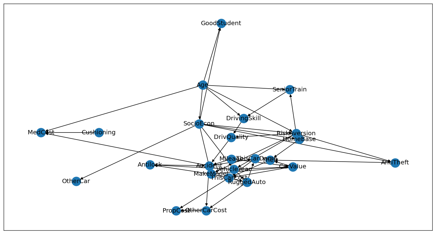
Advantages of using networkx:
Plotting with
networkxcan be much simpler since it usesmatplotlibto create the graph. Anyone familiar withmatplotlibcan use it to customise the graph to his/her needs.We have much more control over the image since we have all
matplotlibfunctionality available. We can, for example, easily change the positions of a node by hand.Documentation is more readable, since it is purely in Python.
Disadvantages:
Features like splines on edges, gradient colored edges are not readily available in
networkx.Layouts in Pyvis tend to produce better node positions.
networkximages may need fine tuning in the end.
We exemplify below how to obtain, with networkx, similar plots to what we got with plot_structure.
[14]:
### run a layout algorithm to set the position of nodes
# pos = nx.drawing.layout.circular_layout(g) # various layouts available
# pos = nx.drawing.layout.kamada_kawai_layout(g)
# pos = nx.drawing.layout.planar_layout(g)
# pos = nx.drawing.layout.random_layout(g)
# pos = nx.drawing.layout.rescale_layout(g)
# pos = nx.drawing.layout.shell_layout(g)
pos = nx.drawing.layout.spring_layout(g, seed=0)
# pos = nx.drawing.layout.spectral_layout(g)
# pos = nx.drawing.layout.spiral_layout(g)
# pos = nx.drawing.nx_agraph.graphviz_layout(g, prog="neato")
# pos = nx.drawing.nx_agraph.graphviz_layout(g, prog="dot")

pos
[14]:
{'Age': array([-0.1156687 ,  0.52073627]),
 'SocioEcon': array([-0.26498101,  0.27637484]),
 'OtherCar': array([-0.85757751,  0.35456912]),
 'GoodStudent': array([-0.16758151,  1.        ]),
 'RiskAversion': array([-0.01608799,  0.0352858 ]),
 'VehicleYear': array([-0.08594314, -0.20117656]),
 'Accident': array([ 0.13881838, -0.24496715]),
 'ThisCarDam': array([ 0.15971475, -0.45618066]),
 'RuggedAuto': array([ 0.03308099, -0.32719595]),
 'MakeModel': array([-0.28513872, -0.11216075]),
 'Mileage': array([ 0.10186333, -0.15299145]),
 'DrivQuality': array([-0.13971029, -0.02112685]),
 'Antilock': array([-0.15987361, -0.25117089]),
 'DrivingSkill': array([-0.30032307,  0.09292107]),
 'SeniorTrain': array([-0.42573094,  0.31731686]),
 'Theft': array([ 0.15574209, -0.18984148]),
 'ThisCarCost': array([ 0.21964653, -0.34602757]),
 'CarValue': array([ 0.04859493, -0.18241035]),
 'HomeBase': array([ 0.06689539, -0.05314831]),
 'AntiTheft': array([ 0.51730348, -0.16245643]),
 'OtherCarCost': array([ 0.20388788, -0.41273358]),
 'PropCost': array([ 0.31356729, -0.55078043]),
 'MedCost': array([0.50316311, 0.59859867]),
 'Cushioning': array([0.35633833, 0.46856576])}
[15]:
# We can change the position of specific nodes
pos["Cushioning"] = (-0.1, 0.7)
pos["SeniorTrain"] = (0.1, -0.7)
[16]:
fig = plt.figure(figsize=(15, 8))  # set figsize
ax = fig.add_subplot(1, 1, 1)
ax.set_facecolor("#001521")  # set backgrount

# add nodes to figure
nx.draw_networkx_nodes(
    g,
    pos,
    node_shape="H",
    node_size=1000,
    linewidths=3,
    edgecolors="#4a90e2d9",
    node_color=["black" if "Cost" not in el else "#DF5F00" for el in g.nodes],
)
# add labels
nx.draw_networkx_labels(
    g,
    pos,
    font_color="#FFFFFFD9",
    font_weight="bold",
    font_family="Helvetica",
    font_size=10,
)
# add edges
nx.draw_networkx_edges(
    g,
    pos,
    edge_color="white",
    node_size=1000,
    arrowsize=14,
    width=[w + 0.5 for _, _, w, in g.edges(data="weight")],
)

x = min([pos[node][0] for node in pos.keys()])-0.05
y = max([pos[node][1] for node in pos.keys()])-0.05

plt.text(x, y, "The structure of our\n Insurance model", color="white", size=20)
plt.show()
Manual adjustment
Node positions can be adjusted manually to obtain the desired graph. In the following we will try to recreate the graph we obtained using pyvis.
[17]:
pos = nx.drawing.layout.spring_layout(g, seed=0)
pos
[17]:
{'Age': array([-0.1156687 ,  0.52073627]),
 'SocioEcon': array([-0.26498101,  0.27637484]),
 'OtherCar': array([-0.85757751,  0.35456912]),
 'GoodStudent': array([-0.16758151,  1.        ]),
 'RiskAversion': array([-0.01608799,  0.0352858 ]),
 'VehicleYear': array([-0.08594314, -0.20117656]),
 'Accident': array([ 0.13881838, -0.24496715]),
 'ThisCarDam': array([ 0.15971475, -0.45618066]),
 'RuggedAuto': array([ 0.03308099, -0.32719595]),
 'MakeModel': array([-0.28513872, -0.11216075]),
 'Mileage': array([ 0.10186333, -0.15299145]),
 'DrivQuality': array([-0.13971029, -0.02112685]),
 'Antilock': array([-0.15987361, -0.25117089]),
 'DrivingSkill': array([-0.30032307,  0.09292107]),
 'SeniorTrain': array([-0.42573094,  0.31731686]),
 'Theft': array([ 0.15574209, -0.18984148]),
 'ThisCarCost': array([ 0.21964653, -0.34602757]),
 'CarValue': array([ 0.04859493, -0.18241035]),
 'HomeBase': array([ 0.06689539, -0.05314831]),
 'AntiTheft': array([ 0.51730348, -0.16245643]),
 'OtherCarCost': array([ 0.20388788, -0.41273358]),
 'PropCost': array([ 0.31356729, -0.55078043]),
 'MedCost': array([0.50316311, 0.59859867]),
 'Cushioning': array([0.35633833, 0.46856576])}
[18]:
pos['Age'] = (0.2, 1.)

pos['SocioEcon'] = (-0.1, 0.78)

pos['RiskAversion'] = (0.4, 0.56)

pos['SeniorTrain'] = (0.15, 0.34)

pos['VehicleYear'] = (-0.5, 0.12)
pos['MakeModel'] = (-0.05, 0.12)
pos['DrivingSkill'] = (0.6, 0.12)


pos['DrivQuality'] = (-0.2, -0.12)
pos['Mileage'] = (-0.9, -0.12)
pos['Antilock'] = (0.2, -0.12)


pos['Accident'] = (-0.7, -0.34)
pos['RuggedAuto'] = (-0.5, -0.34)
pos['CarValue'] = (0, -0.34)
pos['HomeBase'] = (0.5, -0.34)
pos['AntiTheft'] = (0.8, -0.34)

pos['ThisCarDam'] = (-1, -0.56)
pos['Theft'] = (0.2, -0.56)

pos['ThisCarCost'] = (-0.55, -0.78)
pos['OtherCarCost'] = (-0.15, -0.78)
pos['Cushioning'] = (1, -0.78)


pos['OtherCar'] = (-0.8, -1.)
pos['GoodStudent'] = (-0.3, -1.)
pos['PropCost'] = (0.15, -1.)
pos['MedCost'] = (0.45, -1.)
[19]:
fig = plt.figure(figsize=(15, 8))  # set figsize
ax = fig.add_subplot(1, 1, 1)
ax.set_facecolor("#001521")  # set backgrount

# add nodes to figure
nx.draw_networkx_nodes(
    g,
    pos,
    node_shape="H",
    node_size=1000,
    linewidths=3,
    edgecolors="#4a90e2d9",
    node_color=["black" if "Cost" not in el else "#DF5F00" for el in g.nodes],
)
# add labels
nx.draw_networkx_labels(
    g,
    pos,
    font_color="#FFFFFFD9",
    font_weight="bold",
    font_family="Helvetica",
    font_size=10,
)
# add edges
nx.draw_networkx_edges(
    g,
    pos,
    edge_color="white",
    node_size=1000,
    arrowsize=14,
    width=[w + 0.5 for _, _, w, in g.edges(data="weight")],
)

x = min([pos[node][0] for node in pos.keys()])-0.05
y = max([pos[node][1] for node in pos.keys()])-0.05

plt.text(x, y, "The structure of our\n Insurance model", color="white", size=20)
plt.show()
The plot we got with plot_structure:
[20]:
viz8.show('supporting_files/03_final_plot.html')
[20]:
References
[1] [pyvis read the Docs](https://pyvis.readthedocs.io/en/latest/index.html) [2] [network documentation](https://visjs.github.io/vis-network/docs/network/index.html)
Note
Found a bug, or didn’t find what you were looking for? 🙏Please file a ticket